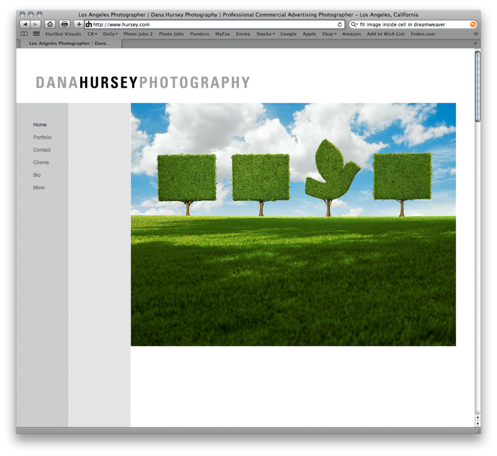
In addition to our recently added Mobile Site, we have just done a major revamp of our traditional website. Earlier this year we increased the size of the imagery about 20%. But when it came right down to it, that just wasn’t enough. So while there are a few additions and tweaks still to be done, the latest iteration of hursey.com is up and running. And BOY is it BIG. We stuck with a traditional HTML site for speed, ease of use, compatibility, – and yes, better search engine rankings. We have consolidated some sections, done away with others, and added some new functionality. For instance, in our Client List area, you can now roll over most client names and see samples of previous work we have done for them. And oh… in the Portfolio section, the images are nice and big! Because after all, that is what you are coming to see… Right? It really is a different viewing experience! So check it out and see for yourself. We’ve said it before and we’ll say it again… Bigger IS Better!
Dana Hursey Photography Blog
Los Angeles Photographer

